Machine Learning Visualization with Yellowbrick
Visually explore, tune, and select machine learning models

Contents
- Introduction
- Classification demo
- Conclusion
- References
Introduction
It is well known that data is a critical part of machine learning (ML) projects — especially, the data that is used as input to ML algorithms. However, there is also the data that gets generated during the model development process that gets a bit less attention.
While developing models, a lot of data is generated that needs to be distilled to inform future iterations and experiments, as well as select models that are most likely to achieve their desired ends within a set of constraints (e.g. model size, time-to-train, acceptable error rate, etc).
Practitioners may simply print or tabularize some of this data, but visualizations are very natural way to quickly make sense of much of the data produced during model development. Unfortunately, libraries like matplotlib provide too low-level an interface for us to be highly productive and seaborn is better suited to statistical visualizations.
This post features Yellowbrick, a Python library that presents a high-level interface built atop matplotlib and scikit-learn to help us plot common visualizations relevant to model training, tuning, and evaluation.
Classification demo
In this section, I demonstrate a highly visual approach to developing ML models using scikit-learn and Yellowbrick by training and evaluating two decision tree classifiers for the WINE dataset [4] using scikit-learn [5] and Yellowbrick [1].
Imports and constant initialization
import numpy as np
from sklearn.datasets import load_wine
from sklearn.model_selection import (
    cross_val_score,
    train_test_split
)
from sklearn.tree import DecisionTreeClassifier
from yellowbrick.classifier import confusion_matrix
from yellowbrick.model_selection import (
    learning_curve,
    validation_curve,
    cv_scores
)
from yellowbrick.target import class_balance

RANDOM_STATE = 42
CV = 10
NJOBS = -1
SCORING = "accuracy"

%matplotlib inline
Load the dataset
wine = load_wine()
X, y = wine.data, wine.target
Check class balance
class_balance(y)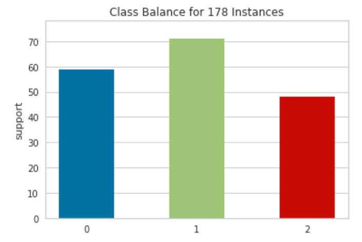
Yellowbrick’s class_balance function [6] lets us easily visualize a histogram of class frequencies for our dataset. The histogram shows that WINE is a tiny dataset with a meager 178 examples and that its classes are fairly balanced. With this visualization, we can quickly determine the presence (or absence) of class imbalances, which in turn informs our choice of evaluation metrics and whether or not we may need sampling techniques such as oversampling minority classes or under-sampling majority classes.
Because the WINE classes are fairly balanced, we won’t need any sampling techniques, and the standard accuracy metric is a decent choice for this demonstration.
Split data
Here we perform a stratified split of the WINE dataset to use 75% of its data for model training and the remaining 25% for testing. Scikit-learn’s train_test_split function performs a stratified split by default, which preserves the proportions of class occurrences between the full dataset and the split data.
X_train, X_test, y_train, y_test = train_test_split(
    X, y, test_size=0.25, random_state=RANDOM_STATE
)
We can see this at a glance by passing both the training and test labels to the class_balance function.
class_balance(y_train=y_train, y_test=y_test)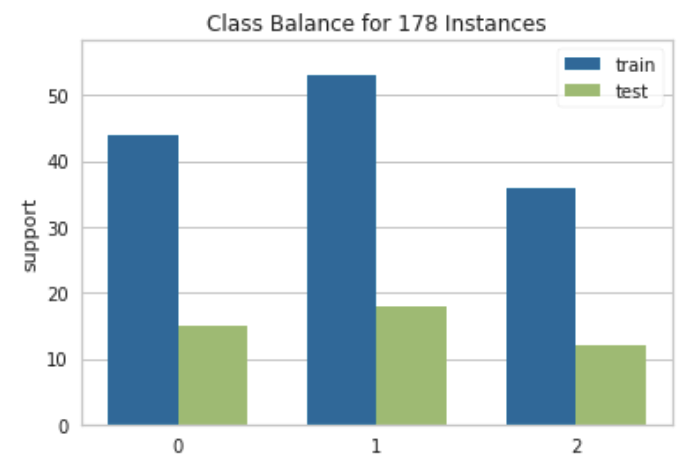
Train models
dt = DecisionTreeClassifier(random_state=RANDOM_STATE)
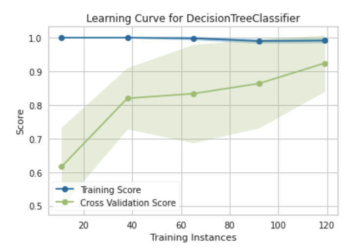
dt.fit(X_train, y_train)Decision trees are simple, easy-to-interpret models with many desirable properties such as requiring little data preparation and being able to handle multi-class prediction problems. However, decision tree learners are notorious for learning overly complex trees that tend to result in models that overfit and don’t generalize well.
We can use a learning curve to get an idea of whether or not the decision tree we learned shows signs of overfitting (or underfitting).
A learning curve shows the relationship of the training score versus the cross validated test score for an estimator with a varying number of training samples. [2]
We can use a learning curves to determine if our model is likely to improve with additional data, as well as determine our model’s sensitivity to error due to bias or variance.
learning_curve(
    estimator=dt,
    X=X_train,
    y=y_train,
    cv=CV,
    train_sizes=np.linspace(0.1,1.0,5),
    n_jobs=NJOBS,
    random_state=RANDOM_STATE,
    scoring=SCORING
)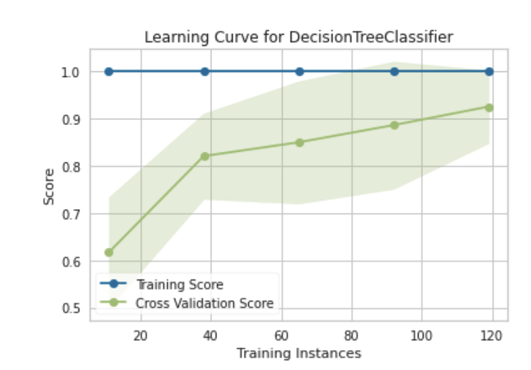
This learning curve tells us that our decision tree classifier is not sensitive to error due to bias as indicated by the lack of variability in the training scores. It also shows that the model overfits the training data from the outset and continues to do so as more training instances are added. This is expected of fully-grown decision trees and doesn’t tell us the full story of whether or not the model is likely to generalize well when presented with unseen examples.
The cross validation scores tell us the remainder of the story. In this instance, there is consistent high variability in the cross validation scores as the number of training instances increase, which is indicative of the classifier being sensitive to error due to variance. The training and cross validation scores also appear to be converging at a high point as the cross validation score improves with more training instances.
The plot suggest that we have a high variance model that may benefit from additional data. We also have the option of using a less complex model of the same type or a different type of model altogether. With any of these options, we would be looking for potential decreases training score and improvement in cross validation score (upward trend with reduced variability).
We do not have more data to feed our decision tree learner, so we will explore training a simpler model of the same type. One way of reducing the complexity of a decision tree is to prune it. We will try using a pre-pruning strategy — that is, we will preemptively stop the tree from growing to its max depth.
First, let us view the max depth of the current tree. It’s not a deep tree by any stretch of the imagination, and this should be expected given the size of the WINE dataset.
print(dt.tree_.max_depth) # 4Then, we can use a validation curve to plot the influence of a the max_depth hyperparameter on the training and cross validation scores to learn if the model may be underfitting or overfitting for some of max_depth values [3].
validation_curve(
    estimator=dt,
    X=X_train,
    y=y_train,
    param_name="max_depth",
    param_range=np.arange(1, 5),
    cv=CV,
    n_jobs=NJOBS,
    random_state=RANDOM_STATE
)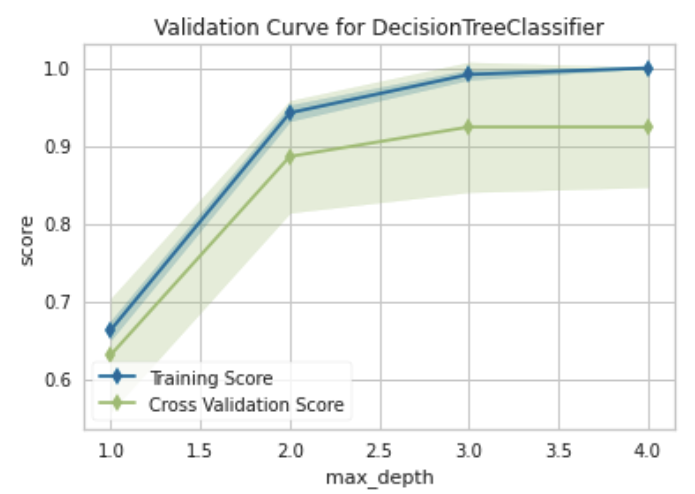
Similar to what we observed on the learning curve, there appears to be consistently high variability in cross validation scores. We also see that, all else held equal, a decision tree with a max_depth of 3 (a simpler model, although by not much) may yield similar results as the fully-grown tree.
We could also visualize the influence of other hyperparameters such as min_samples_split and min_samples_leaf, but you will find that their influence pales in comparison to that of max_depth for this problem.
Now, let us learn a decision tree with a max depth of 3 and see how it compares to the fully grown tree with a max depth of 4.
dt_md3 = DecisionTreeClassifier(
    max_depth=3,
    random_state=RANDOM_STATE
)

learning_curve(
    estimator=dt_md3,
    X=X_train,
    y=y_train,
    cv=CV,
    train_sizes=np.linspace(0.1,1.0,5),
    n_jobs=NJOBS,
    show=True,
    random_state=RANDOM_STATE,
    scoring=SCORING
)
This learning curve closely resembles the learning curve of the unpruned decision tree. There is some perturbation in the training and cross validation scores, but the curve still points to this new tree exhibiting the same characteristics as the first. The model remains more sensitive to error due to variance as the training and cross validation scores converge at a high point. More training data and a model type that better addresses this variance still remain the indicated best avenues for learning a model that is most likely to generalize well.
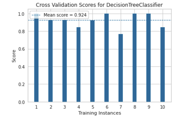
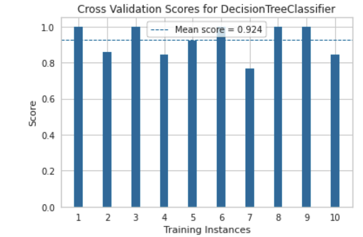
The plots that follow show us just how similar the two learned decision trees are. Their cross validation scores and confusion matrices are very similar. There is not much more that can be done to significantly improve the performance for a decision tree classifier on this dataset.
Still, the preceding steps can be repeated for different model types (e.g. support vectors and knn) to find a best-performing model.
Comparing cross validation scores
cv_scores(
    dt,
    X_train,
    y_train,
    cv=CV,
    n_jobs=NJOBS,
    scoring=SCORING,
    random_state=RANDOM_STATE
)
cv_scores(
    dt_md3,
    X_train,
    y_train,
    cv=CV,
    n_jobs=NJOBS,
    scoring=SCORING,
    random_state=RANDOM_STATE
)
Comparing confusion matrices
confusion_matrix(dt, X_train, y_train, X_test, y_test)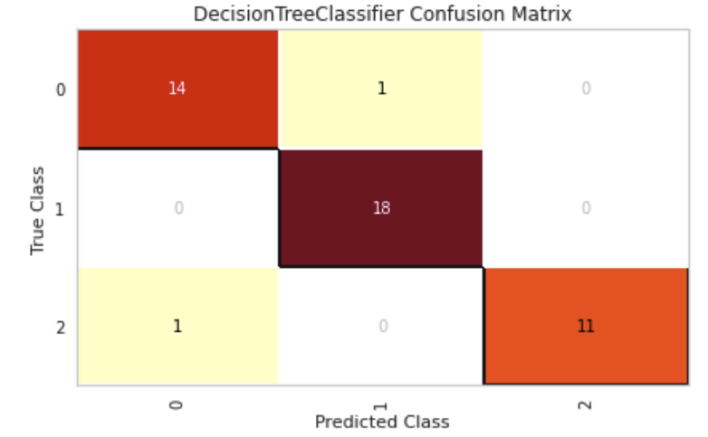
confusion_matrix(dt_md3, X_train, y_train, X_test, y_test)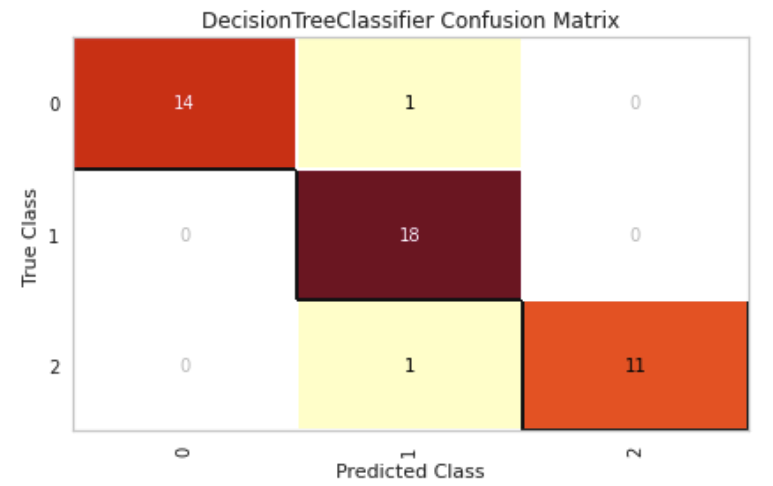
Conclusion
The data generated during model development is necessary to inform future iterations and experiments. Visualizations are a natural way of making sense of this data, and Yellowbrick is an easy-to-use Python library with a high-level interface for plotting common visualizations relevant to training, tuning, and evaluating models with scikit-learn.
This post exclusively featured what Yellowbrick calls quick methods (the visualization functions demonstrated), but there is a slightly more verbose object-oriented interface that may afford some more-than-basic interactions. There are also several other visualizations that Yellowbrick affords for a variety of purposes such as regression, clustering, feature analysis, and text modeling. I highly encourage checking out the library’s documentation to learn more if interested.
References
- Yellowbrick: Machine Learning Visualization
- Yellowbrick: Machine Learning Visualization — Learning Curve
- Yellowbrick: Machine Learning Visualization — Validation Curve
- Dua, D. and Graff, C. (2019). UCI Machine Learning Repository [http://archive.ics.uci.edu/ml]. Irvine, CA: University of California, School of Information and Computer Science. WINE data set.
- Scikit-learn: Machine Learning in Python
- Yellowbrick: Machine Learning Visualization — Class Balance